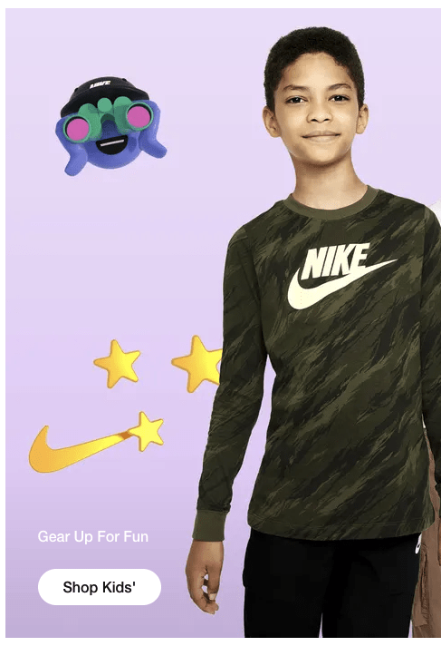
One of my favourite things about design is colour theory. It’s a fascinating subject both mathematically and artistically, but also a very prominent area within user experience (UX) and web design. Making ourselves aware of the impact of colour can help us develop more inclusive digital products, as well as meaningful brand interaction. Bad example: ‘Gear Up For Fun’ is hard to read.
Designing for accessibility is about creating experiences that can be enjoyed by as many people as possible. Picking the right colours means that we can make elements of the user interface (UI) more comfortable to view for the masses. In the UK alone there are almost 2 million people living with sight loss, and approximately 3 million people with colour blindness. Even when we create design systems it’s important to take colour choices seriously because getting it wrong can exclude people who would otherwise become future customers.
Measuring the perceived luminance: Thankfully the hard part is done for us already and there is a published document with details on how best to keep things accessible. The Web Content Accessibility Guidelines (WCAG 2.1) is a bit of a mouthful, but it outlines a host of recommendations to help us design with visual impairments in mind. It tells us that we can measure the perceived luminance by comparing the foreground versus background. Unless you pay close attention to your colours when designing, it is likely that most designs will get flagged for contrast issues. Without getting too technical on the math involved, the colours need to meet the magic contrast ratio of 4.5:1 for normal text elements. Meeting the requirements gives you the AA gold standard which is of course much easier to use. Good example: All the text has a high degree of contrast and is consistant.
There are some exceptions to the rule:
- Large text only needs a 3:1 contrast ratio.
- Incidental text or imagery purely for decoration have no requirements.
- Brand logos don’t have any requirements.
Here are some examples of images which pass or fail the guidelines, using a handy contrast checker webaim.org/resources/contrastchecker/
Bad example:'Gear up for fun' fails contrast checks.
Bad example: Clean design however small text will fail contrast ratio
Good Example: All the text has a high degree of contrast and is consistant.
Sometimes inverting the foreground colour can help with the contrast ratio, but often it is more appropriate to simply avoid using certain colours for important action areas of product design. Be mindful of hover or focus effects on elements such as buttons, any change in colour also needs to be compliant. Okay example: Mostly fine however the black/red likely to fail checks.
Don’t rely on colour alone: Icons are a great way to introduce a meaningful shape to an area that may only have a difference in colour. Error states and system warnings should be coupled with imagery or text to clearly denote any differences — don’t fall into the trap of using a traffic lights system without using icons or text.
Document the colour choices for your team: Finally, when you’re working with a team or about to pass designs on it makes a world of difference for everyone involved if colours are documented. Here at VizCareer we have our colour choices saved as part of our technical docs; each of our colours have an attached contrast which is typically either dark (#222) or light (#FFF), saved into a machine friendly JSON object. A visual representation can also be helpful too for anyone looking for a quick reference. Here’s a snippet of VizCareer’s.
One slice of the accessibility pie: Diversity and inclusion is a huge focus here at VizCareer and accessibility is something we spend a lot of time working on. Colour is important but it is just one area of attention. The WCAG2.1 can be daunting but there is a load of resources out there to help you achieve a more accessible experience for your user-base. If you plan on having an accessible recruitment process, then check us out for your next role.
Helpful sources:
NHS, 2018 on vision loss — https://www.nhs.uk/conditions/vision-loss/
Colour blind awareness — https://www.colourblindawareness.org/colour-blindness/
WCAG2.1 contrast — https://www.w3.org/TR/WCAG21/#contrast-minimum
Wong on colour — http://jamie-wong.com/post/color/


